
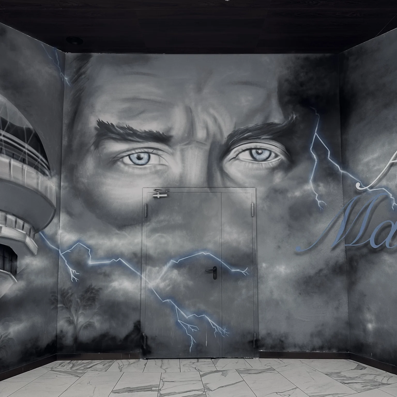
A name, short phrase or original letter composition can be the main element of wall art. Having words painted at a large size and developing typography specifically for a space are different needs.
When planning typographic graffiti, consider the letters' shapes, arrangement and viewing distance as well as the meaning of the words. Explain what you want the text to say and how it should be perceived.
Is the lettering decorative or informative? Not all lettering is intended to be equally readable. A brand name, message and experimental composition carry different priorities.
If the work needs to convey information, establish that expectation at the outset. Decorative artwork should not replace required directional or warning signs. Keep the distinction between artistic expression and functional information clear.
How does text length change the design? A single word and a long sentence require different scales on the same surface. Discuss the message's priorities instead of shrinking letters to fit everything in.
Bring approved wording to the first conversation if possible. Adding words after the design develops can change line breaks and the whole composition. Check spelling, punctuation and the language version again before application.
How do letters relate to the space? Wall width, height, columns and doors can interrupt a composition. Assess boundaries, spacing and the direction of lines in relation to those conditions.
Review proposed views if the work will be seen obliquely or from a distance. Discuss reflections in mirrors and likely photographic framing too. Do not assume identical readability from every angle.
An existing font or original lettering? An established brand typeface may be used, or new letterforms developed for the project. The design process and deliverables may differ.
Confirm font usage rights and that brand files are current. Rather than copying another artist's lettering, explain the qualities you like so that an original approach can be developed.
What information supports a quotation? Share approved text, wall photographs, approximate dimensions, intended use and references. Clarify design, preparation and application separately. Sign manufacture, neon and other production should not be assumed to be included.
Share your wording and wall on WhatsApp. Graffiti Ankara can discuss an approach to lettering, colour and composition.