
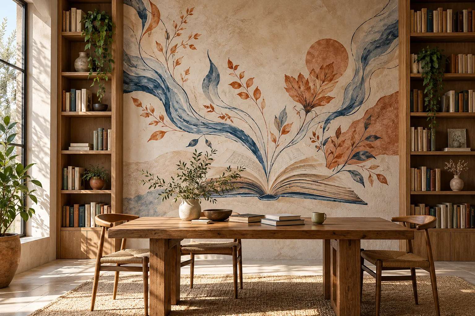
For an Ankara library or reading space mural, the first question is not simply which writer’s portrait to paint. Shelves, reading tables and existing information also affect the visual decision.
Discuss where the artwork should be concentrated and which areas remain quieter. An entrance wall and a surface people face for long periods may serve different purposes. Develop the design around actual use.
Will the wall behind the shelves be visible? A broad surface in an empty-room photograph may be largely hidden once bookcases arrive. Share shelf heights and how they will be filled.
Assess plans and photographs together to avoid placing key elements in concealed areas. If new shelves are expected, make clear which arrangement guides the design.
Should quotations or author portraits be included? Text and portraits are options, not requirements. Abstract lines, original figures and indirect references to books can also be considered.
For quotations, check the wording, attribution and rights. Assess portrait photograph sources separately. Online availability does not establish commercial or institutional permission. Agree content approval before the visual design.
How do reading and circulation areas differ? Artwork at reception and around reading tables may have different densities. Keep essential shelf, department and exit signs clear.
Art does not replace wayfinding. Do not claim that colours affect everyone’s attention or reading performance in a specific way. Explain goals through appearance, scale and spatial relationships.
What should be shared first? Reader profiles, approximate dimensions, shelving layouts and institutional visual guidelines are useful. Discuss use during application, preparation and the schedule separately.
Graffiti Ankara is based in Ankara. This article does not describe a completed library project. Share photographs and a brief idea on WhatsApp, and assess a suitable design scope together.